Overview
Yoga-related injuries are common, particularly for beginners or those practicing at home without guidance. Recognizing the challenges of accessing appropriate care for self-managing yoga injuries inspired us to create a digital rehabilitation solution. This opportunity led to the development of a dedicated website and app designed to provide high-quality injury rehabilitation accessible to everyone, anywhere.
Roles
Role: UX, Visual Design, Branding & Identity
Date: Fall 2022
Duration: 6 weeks
Skills: Competitive analysis, ideation, user stories and flows, persona creation, survey design, user interviews and observations, sketching, wireframing, prototyping, user testing, and analysis.
Challenges
To facilitate pain diagnosis through the app, we aim to gather comprehensive information while minimizing user effort and avoiding a lengthy process. After obtaining a diagnosis, the app will recommend the best treatments and provide ongoing support to guide users through each step of their recovery journey.
Solution
By asking targeted questions about pain and symptoms, the app will quickly suggest the most effective treatments. We will categorize injuries based on common types to enhance the accuracy of the pain diagnosis.
Audience
My target audience consists of individuals practicing yoga at home through YouTube or various apps. Typically, they lead busy lives and lack the time to attend yoga studios. Most are beginners or intermediates who perform yoga exercises without the guidance of a personal instructor, which often results in injuries due to improper form and technique.
Tools
Tools that are used in this project:

Goals
Assist users in identifying appropriate treatments for their common injuries.
Discover healing yoga exercises designed to alleviate pain and promote recovery.
Provide a connection to a physician for professional consultation and guidance.
Identify strategies to prevent injuries and promote safe yoga practice.
Design Process

Underestand
User survey
User interview
Competitive analysis

Define
User persona
Empathy map
User journey

Ideate
User flow
Information Architecture

Design
Wireframe
Hi-Fi Designs
Branding
Prototype

Test
Feedback
Conclusion
Future concept
User Research
Research Strategy: Our initial focus was on developing a robust research strategy. We began with survey research, which helped us identify potential users for interviews. Following this, we conducted user interviews and performed a competitor analysis, gaining valuable insights into the market landscape and context for our problem. Next, we created an interview guide to prepare for usability testing, ensuring that our interviews were conducted in a consistent and controlled manner.
User survey
I conducted an online survey among friends and family to include diverse perspectives across different ages and backgrounds. The aim was to understand the true users, their pain points, and their needs. Using Google Forms, I collected valuable data from 28 responses. The survey consisted of 17 questions focused on yoga and common injuries, helping us gain insights into how we can best address these issues through the website and app.
User interview
I conducted interviews with three individuals from the survey who reported experiencing injuries during their yoga sessions. I asked eight targeted questions to gain insights into how to improve their treatment experience and help them find the best solutions for their injuries.
From their feedback, we compiled key soundbites and insights, which we organized over a few hours to identify the most common pain points and areas of focus.
Interview Questions:
-
How experienced are you in yoga?
-
Have you ever had a yoga instructor?
-
How often do you get injured?
-
Do you know what caused your injury?
-
What do you typically do to alleviate your pain?
-
Can you describe the details of your pain?
-
How often do you visit a physician?
Key Insights:
-
Users are uncertain whether they are performing yoga poses correctly.
-
Most participants were beginners and lacked knowledge about proper poses.
-
They often relied on remedies they had heard about or used for previous injuries.
-
Users find it challenging to determine which treatment to begin with, such as whether to use ice or heat.
Sara Young, CA
“Whenever I got injured after a while that I feel better I start my normal life and sometimes the pain goes back worse, I don't know how much needed the treatment finish completely."
Morgan James, NY
"I often got injured in my neck and lower back."
Mike Driver, MI
“I do yoga once in a while, so my body can't tolerate some poses and it causes the injury.”
Keynotes from the research
-
Design a user-friendly interface that guides users in finding the most effective treatment for their pain.
-
Include a prevention section that explains the causes of injuries and how to avoid them in the future.
-
Provide a step-by-step treatment plan for each day, allowing users to track their progress.
-
Offer an overview of the entire treatment process, giving users a clear understanding of what to expect.
-
Incorporate instructional videos for exercises to enhance user engagement and understanding.
-
Include an option for users to view their previous injuries, helping them keep track of their treatment history and progress.
Persona
Based on the insights gathered during the research phase, I analyzed my observations and synthesized the data to define the core problems identified. To make the users more concrete and relatable, I developed two personas that encapsulate the information collected, providing a clearer understanding of their needs and challenges.


Creating a user flow for Mike helped us map out key steps and pages, clarify his navigation through the website and app, and identify important decisions for a seamless experience.
Journey map
After developing the persona, I created a journey map to deeply empathize with Mike’s experience in finding treatments for his lower back pain through the application. This exercise illuminated the emotions Mike would encounter during his journey, revealing new design opportunities for the Ropana website and app.

Empathy map
I created an empathy map to capture Mike's thoughts, feelings, actions, and words, helping to deepen our understanding of his user experience.

Swat analysis
Competitor Analysis
Competitors:
-
Exact Health
-
Sports Injury Treatment App
-
Exercises to Reduce Pain
As part of our competitor analysis, we examined three apps that share similar offerings with Ropana: Exact Health, Sports Injury Treatment App, and Exercises to Reduce Pain. Our research focused on user interface elements and user experience flows, specifically how these apps suggest treatment plans, diagnose pain, and outline the treatment process.
While these applications cater to a broader range of sports injuries rather than just yoga-related issues, they provided valuable insights into effective treatment methodologies. By analyzing their strengths and weaknesses, we identified key opportunities to enhance Ropana's solutions for users seeking relief from common yoga injuries.

Key Findings from SWOT Analysis:
-
Categorization: Organize content effectively so users can easily locate solutions.
-
Minimal Design: Implement a clean and simple interface for a seamless user experience.
-
Multiple Pathways: Provide diverse methods to meet user preferences and achieve desired outcomes.
-
Efficiency: Streamline the process to find treatments in the fewest possible steps.
-
Smart Chat Feature: Introduce an intelligent chat option for instant support and guidance.
-
Physician Consultation: Allow users to consult a physician for professional advice and treatment
Information Architecture
User story
High-priority user stories:
-
As a user, I want to create a pain-based treatment plan for quick solutions.
-
As a user, I want to select my pain area to receive targeted treatments.
-
As a user, I want to review my treatment plan to start my recovery.
-
As a user, I want to access physician information to schedule online appointments.
Mid-priority user stories:
-
As a user, I want to access pain prevention resources for future avoidance.
-
As a user, I want to view my exercise plan for the next day to continue my routine.
-
As a user, I want to find my treatment plan to begin my recovery process.
Low-priority user stories:
-
As a new user, I want to sign in to access my profile.
-
As a user, I want to set reminders for my plans.
-
As a user, I want to view my profile to see previous treatment plans.
User flow
Using high-fidelity user stories, I developed user flows to outline navigation paths through the website and app, addressing specific problems. This marked the initial step in prioritizing screens, ultimately guiding the creation of a site map and sketches.
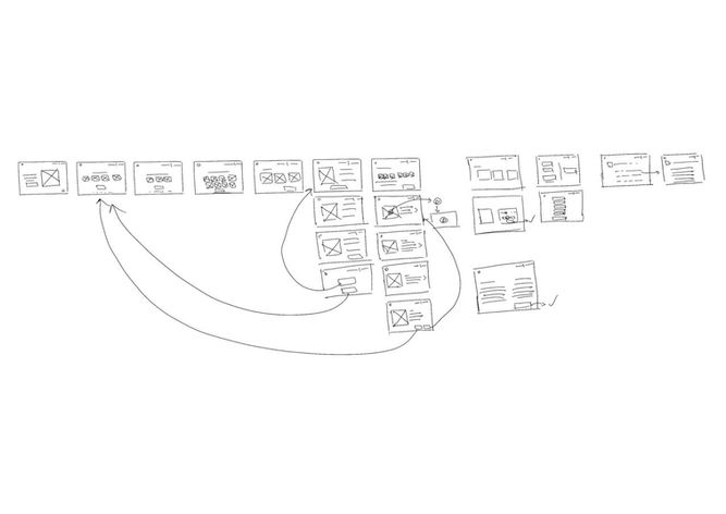
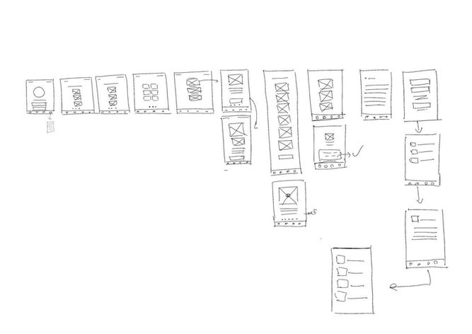
After establishing the user flows, I sketched my ideas to quickly visualize concepts, identify pain points, and make necessary corrections before transitioning to digital designs.
User flow sketch

User flow digital

Site map
After analyzing the screens outlined in the user flows, I created a site map to organize them and establish the hierarchical structure of the app.

Style guide
Logo
I explored different logo symbols and wordmarks to effectively communicate the app’s brand identity and values. Ultimately, I chose a design featuring a yoga pose in the negative space of a circle, with the letter "R" representing ROPANA, which means "healing" in Sanskrit.

ROPANA
Color palette
To ensure a consistent brand experience and visually appealing UI elements, I developed a style guide that includes typography, iconography, and color schemes. This guide facilitates a seamless aesthetic experience for users.
I chose green and purple for the color palette. Green symbolizes healing, energizing the heart, lungs, and digestive system, while also promoting growth and tissue rejuvenation. It supports the circulatory system, enhancing blood flow. Purple, on the other hand, is associated with both earthly and spiritual power and is commonly used in healing contexts.

Typography

Font size

Iconography

Illustration


The user interface was designed with a focus on key User Experience principles:
-
Hick’s Law was applied to maintain simplicity by limiting the number of choices presented to users.
-
Fitt’s Law, a fundamental concept in Human-Computer Interaction, guided the strategic placement of Call to Action (CTA) buttons throughout the app.
-
The Zeigarnik Effect was considered to keep users informed about their completed and incomplete tasks.
-
The Law of Proximity and the Law of Common Region were employed to effectively group related elements within the app, utilizing clear boundaries and appropriate spacing.
Accessibility
Color contrast testing result:
Home page
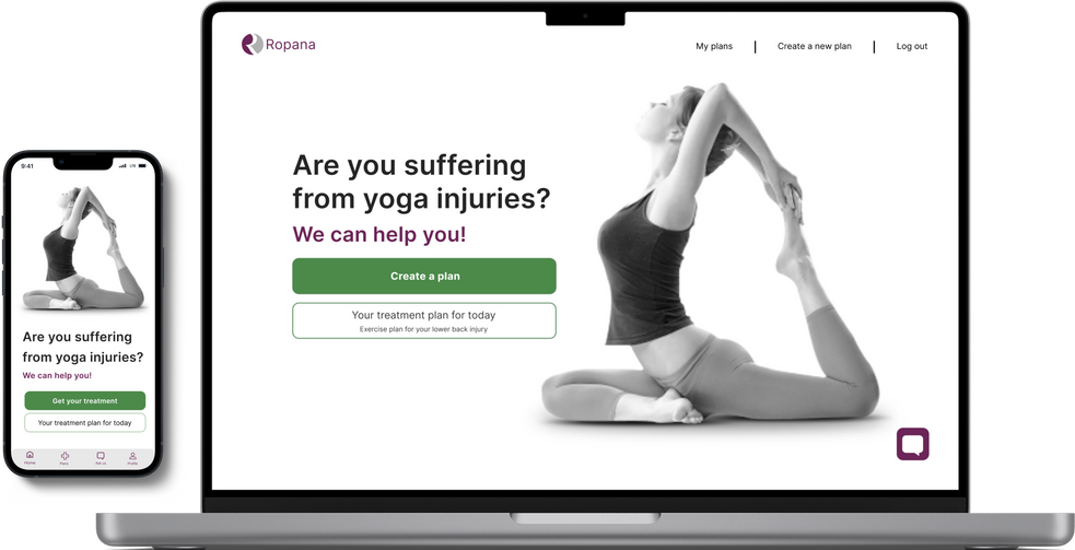
I introduced the homepage to serve as a central hub for users to initiate their treatment plans. From this homepage, users have the option to sign in to their profile, create a new treatment plan, or continue with their existing plan.
Additionally, we have integrated a chatbot feature. This button is accessible on all pages, allowing users to ask questions and receive assistance whenever they need it.

Question Selection
I decided to introduce guiding illustrations to complement the questions. We opted for illustrations instead of photographs because they are timeless and more effectively convey emotions related to pain.
Sketches/Low-fidelity Wireframes
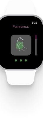
Wireframes serve as a foundational framework for the desktop, app, and watch screens. I began the process with low-fidelity wireframes, sketching initial concepts on paper before transitioning to high-fidelity wireframes designed in Figma.
Wireframe sketches for desktop, mobile app and watch :
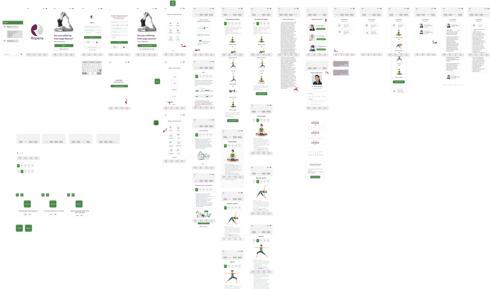
Digital wireframes
The first iteration of digital wireframes for the desktop, mobile, and watch interfaces:
After conducting user testing for the high-fidelity prototype with four participants, I held in-person interviews to observe their behaviors and experiences while completing the assigned tasks.
The tasks I asked users to perform included:
-
Finding a treatment for their back pain.
-
Assessing the severity of their pain and determining the appropriate treatment.
-
Making an appointment with a physician.
User testing feedback:
Results:
-
Task Completion: 60% of users successfully completed the tasks.
-
Challenges: Users found it confusing to locate their treatments.
Recommendations:
-
Page Overview: Provide an overview on each page to help users navigate the entire treatment process.
-
Access to Other Treatment Plans: Allow users to switch to different treatment plans from any step without having to return to the treatment page.
-
Suggested Treatments: Add an overview of suggested treatments on all pages.
-
Categorization: Organize the treatment history based on different treatment types.
Recommendations:
-
Remove the Overview Page: Eliminate the standalone overview page.
-
Integrate Overview on Each Page: Add an overview to each page to enhance users’ understanding of every step and process.
-
Sign-In Option: Include the sign-in option at the beginning for the mobile version and ensure it is also available on the desktop version for users to access their entire treatment history.
-
Dark Mode for Watch: Design a dark mode for the watch interface, as it is more visually appealing and user-friendly in this format.
Here are some of the significant changes I made across various iterations:
-
I added a sign-in option to the homepage, allowing users to access all plans and their history from the start.

-
Instead of maintaining a separate overview page, I integrated the overview into all pages, providing users with insight into each step of the process and allowing them to switch plans as needed.

-
I added an overview to the plan history, allowing users to view their history in a categorized format while also ensuring design consistency.

-
The sign-in page was added to the mobile app upon opening, enabling users to access their history plans, continue their current plan, and connect with the watch.

-
Instead of having the plan overview as a separate section, I merged it with other components, similar to the desktop version, to provide an overview of each treatment plan and allow users to easily switch between plans.

Sara Young, CA
"What is the point of having a separate page to show the suggestion plan?"
Mary James, NY
“It is confusing to me in which step of treatment I’m standing”
Elly James, NY
“I wish I could see my previous plans in a categorized way by each kind of plan and pain”
Lisa Driver, MI
“If I want to check other suggested treatments I should go to the beginning of the treatments”.
User testing
I conducted user testing with three participants, interviewing them in person.
The tasks I asked users to perform include:
-
Finding a treatment for their back pain.
-
Assessing the severity of their pain to determine the appropriate treatment.
-
Making an appointment with a physician.
User testing feedback:
-
Task Completion: 100% of users successfully completed the tasks.
-
Treatment Details: Users found it easier to locate treatment details.
-
Step Navigation: Users could easily identify their current step in the process.
-
Pain Diagnosis: Users appreciated the method used for diagnosing pain.
-
Plan Access: Users were able to easily find their plans and switch between them as needed.
What's next
To enhance the user experience, I would like to introduce a reminder feature for plans, which will notify users of important dates and times to help them remember their treatments, exercises, and physician appointments. Additionally, I propose implementing a feature that allows users to compare plans side by side, providing suggestions on which plans are essential and which are recommended.
Final thoughts
Yoga has gained significant popularity in the Western world, primarily as a physical health practice, but also for stress reduction and overall wellness. However, yoga-related injuries are not uncommon, particularly for beginners or those practicing at home without an instructor.
This presents an opportunity to design a dedicated website and app that makes high-quality injury rehabilitation accessible to everyone, everywhere.
Throughout this project, I explored multiple design directions. The constant feedback I received was invaluable; it helped me understand the best path forward and significantly influenced the final outcome. Additionally, I had the chance to experiment with responsive design, facing numerous challenges to maintain consistency across the desktop, mobile, and watch versions.


