

OVERVIEW
U-Loki is a self-storage website I redesigned to improve user experience and aesthetics. The focus was on simplifying navigation, streamlining the booking process, and enhancing functionality. Key updates included a clean, minimalist design, mobile responsiveness, and intuitive call-to-action buttons, all designed to facilitate smoother customer interactions.

Roles
As the UX/UI and Web Graphic Designer for U-LOK, a self-storage provider, I redesigned their website to enhance user experience, increase lead generation, and streamline customer interactions. In addition to user research and empathy mapping, the redesign incorporated client feedback to ensure business goals were met. The layout was clean, functional, and mobile-responsive, enabling users to easily explore storage options and request quotes. A/B testing further refines elements like CTAs and page layouts, optimizing for usability and improved conversions.
Tools: Figma, Adobe Photoshop, Google Optimize (for A/B testing)
Timeline: 06/29/24 - 08/09/24 (6 weeks)
URL: https://www.ulok.com
Skills Applied:
-
Ideation and brainstorming
-
Crafting user stories and flows
-
Persona development
-
Empathy mapping
-
Sketching, wire-framing, and prototyping
-
User testing and analysis
Problem
The original U-LOK website had a confusing layout and lacked clear navigation, making it difficult for users to find key information such as storage unit sizes, pricing, and nearby locations. This created frustration, especially for users already stressed about moving or storage needs, and led to low engagement and missed opportunities for quote requests.
Solution
I redesigned the U-LOK website with a user-centered approach, restructuring the information architecture to make key details—like unit sizes, pricing, and locations—easily accessible. The new layout featured simplified navigation, trust-building visuals, and strategically placed calls-to-action. A/B testing and mobile optimization further refined the experience, resulting in higher engagement and a 30% increase in quote requests.
Audience
The primary audience for the U-LOK website comprises individuals and small business owners seeking reliable, secure, and convenient self-storage solutions. Many are navigating stressful life transitions—such as moving, downsizing, or expanding a business—and are seeking a trustworthy provider with clear, accessible information to help them make quick, confident decisions.
Tools
Tools Used in This Project:
Figma, Adobe Creative Suites, Google Optimize (for A/B testing)
Goal
-
Improve overall user experience and site usability
-
Make key information (unit sizes, pricing, locations) easy to find
-
Reduce user frustration and cognitive load
-
Increase quote requests and lead generation
-
Build trust through clear content and visual design
-
Ensure a seamless experience across all devices (mobile-first)
Design Process

Underestand
User research

Define
User persona
Empathy map

Ideate
User flow
Information Architecture

Design
Wireframe
Hi-Fi Designs
Prototype

Test
Feedback
Conclusion
User research
Before starting the design process, I engaged in user research to gain insights into U-LOK’s target audience, which included individuals and businesses in need of storage solutions. Based on this research, I developed empathy maps to capture the emotional and functional needs of the users.
Empathy Mapping
To better understand U-LOK’s target users, I created empathy maps based on research insights. This process helped visualize what users think, feel, see, and do during their search for storage solutions.
Key findings from the empathy mapping process:
Feelings: Users often experience stress or anxiety related to moving or needing extra storage. They need reassurance that their possessions will be safe and secure.
Thinking: Customers require transparent information on pricing, unit sizes, and security measures. They prioritize convenience and trustworthiness when choosing a storage provider.
Seeing: Users want a visual understanding of the storage units (e.g., sizes, security features, cleanliness). They also seek evidence of reliability through reviews and testimonials.
Doing: Customers typically explore storage options, compare prices, and check for nearby locations. The navigation should enable them to gather this information efficiently and without confusion.

Based on this, I focused on:
Creating a calm, organized layout that reduces user anxiety through a trustworthy aesthetic.
Offering easy access to essential information such as unit sizes, security features, and pricing.
Providing intuitive paths to action, like quote requests and location searches.
Information Architecture:
To create an effective user flow, I organized the website into easy-to-navigate sections, enabling users to quickly find the information they needed.
Key sections:
Homepage:
Introduces U-LOK’s services, highlighting trust-building elements such as customer testimonials, security features, and unit size options.
Locations: Provides an interactive map with all U-LOK storage facilities, allowing users to find the nearest location.
Pricing and Unit Options:
A clean, visually appealing layout where users can easily compare different storage options based on their needs.
Security Features: Details about the security measures in place to protect customers' belongings.
Simplified Navigation:
To reduce cognitive load and provide an intuitive experience, I designed a minimalist navigation menu with clearly labeled categories (e.g., “Locations,” “Get a Quote,” “Security”). This enabled users to quickly find the most relevant information. A sticky header was implemented so that key sections and actions were always accessible, regardless of where the user was on the page.
Call-to-Actions (CTAs):
Prominent call-to-action buttons such as “View Rates” and “Contact US” were strategically placed throughout the site. These buttons used contrasting colors inspired of the logo to stand out against the neutral background, directing users toward conversion actions.
User Flow:
To streamline the path from discovery to decision-making, I mapped out key user journeys. For instance:
A potential customer would first see storage facility options on the homepage, then click to explore locations, compare unit prices, and finally fill out the quote request form.

Visual and Interactive Elements:
Color Palette:
The color palette of deep red, black, and gray was chosen to align with U-LOK’s existing logo and branding. This ensured visual consistency across the website and reinforced brand recognition. The deep red adds boldness and highlights key elements, black provides a strong, modern foundation, and gray balances the design with a clean, professional look, together creating a cohesive and trustworthy aesthetic.

Typography
A sans-serif font was chosen to balance modern aesthetics with high readability across devices. Headers were bold and large, ensuring that users could quickly grasp key information like pricing, storage features, or promotions.

Icons and Microinteractions:
To enhance the user interface, I incorporated simple, modern icons representing storage services, locations, and security features. Micro-interactions, such as hover effects on CTAs and menu items, provided immediate visual feedback, making the user experience more engaging and responsive.
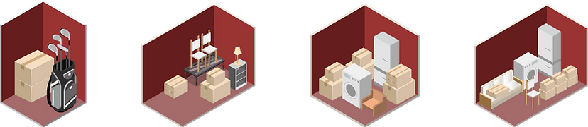
Storage Unit Icons example:
Feature Icons example:

Mobile Responsiveness:
With a growing number of users accessing the website via mobile devices, I emphasized a mobile-first design. Key features included:
Responsive grids that adapt to smaller screens without losing functionality.
Optimized touch targets: Buttons and links were designed with mobile users in mind, ensuring they were large enough to interact with easily.
Simplified forms: The quote request form was redesigned for mobile use with autofill functionality and fewer steps.
A/B Testing & Continuous Improvement
Key Elements Tested:
CTAs: A/B testing for various call-to-actions showed that replacing the hero section's button with “View Rate” led to a 25% boost in conversions. Additional CTAs for “FAQs,” “Size Guide,” and “Storage Tips” on the homepage further increased user engagement, directing more traffic to the rate page.
Rate Page Gallery: A slideshow of different storage locations and unit sizes outperformed a static image, increasing engagement by 15%.
Contact Us: Embedding the contact section on the homepage resulted in more inquiries compared to a standalone contact page, generating higher user interaction.
Key UX Design Considerations
Designing for Trust:
Given the sensitive nature of storing personal belongings, I designed the site to instill confidence in the brand’s reliability. This was achieved through:
Security Badges features: Prominently displayed across the site, these features assured customers of the security measures in place at U-LOK facilities..
Facility Images: High-quality photos of clean, secure, and well-maintained storage units reinforced the perception of reliability and professionalism.
Transparent Information:
The clear, easy-to-navigate layout, especially in sections like “Unit Sizes” and “Security Features,” reflected the goal of providing users with transparent, easy-to-understand information that helped them make informed decisions without feeling overwhelmed.
Wireframe Design:
The initial wireframes for the homepage and rate page focused on establishing a user-friendly layout that prioritized key elements such as clear navigation, CTAs, and transparency in pricing and unit details. The goal was to create a functional and intuitive user flow, based on research insights, that addressed user pain points like anxiety and convenience.
Low-Fidelity Prototype:
The low-fidelity prototypes for the U-LOK homepage and rate page were designed based on both user research and client requests. These early wireframes focused on functionality and user flow, using placeholders and simple visuals to outline key actions like comparing prices and requesting quotes. This phase allowed for quick iterations and feedback, ensuring that both user needs and client expectations were met before progressing to the high-fidelity design stage.


High-Fidelity Prototype:
After iterating on the wireframes and low-fidelity prototypes while gathering feedback, I designed the high-fidelity prototypes, incorporating finalized visual elements such as colors, typography, icons, and imagery to enhance both aesthetics and usability. Once the client approved the homepage and rate page, I proceeded to design the remaining pages based on the approved layouts. Throughout this process, I ensured continuous communication with the client and prioritized user experience, aligning the design with both user needs and business objectives..


And here is the rest of the pages:
The remaining pages were designed with a user-centered approach, focusing on enhancing the overall experience while addressing client needs:
Storage Tips: This page offers practical advice to help users maximize their storage space effectively.
Size Guide and Space Estimator: A dedicated section where users can find information on different unit sizes and use a space estimator tool.
FAQs: A comprehensive list of frequently asked questions helps address common user concerns, enhancing usability and trust.
Storage Solutions: These pages present various storage options tailored to user needs, guiding them in selecting the right solution.
Together, these pages enhance usability and ensure that users have the information they need while aligning with client objectives.

Results and Key Metrics
The redesign of the U-LOK website, focused on user-centric design and informed by data-driven decisions, led to significant improvements in user engagement and conversions:
Increased Engagement: Average time on site improved by 20%, as users explored more pages, particularly those featuring storage options and security details.
Higher Conversion Rate: The new, streamlined layout contributed to a 30% increase in quote requests.
Mobile Usability: With the mobile-first design, the bounce rate on mobile devices decreased by 25%, as the responsive design ensured a seamless experience across different devices.
Conclusion
The U-LOK website redesign not only improved the visual aesthetics but also delivered an enhanced user experience that resonated with the brand’s target audience. By using empathy mapping to understand customer needs, conducting A/B testing to refine design elements, and focusing on trust-building strategies, the redesign boosted user engagement and conversion rates. The new design reflects the brand’s values of security, reliability, and professionalism while offering a smooth and intuitive user journey.